Is Food Delivery catering for the rural?
The pandemic has brought us a 'new normal'; one such shift has been housing demand. With people looking to relocate to homes outside the city, we look at whether Food Delivery is catering for the Rural.

As the UK continues to adjust to post-lockdown life, exactly how the “new normal” settles remains to be seen. One industry which has seen major changes is F&B, more specifically in food delivery. Delivery sales have increased substantially in the wake of the pandemic.
During this time, I’ve moved out of Central London, from Zone 2 to Zone 6. One of the first things I noticed about my new area is the reduced takeaway options available to me now, and how this varies by platform. This got me thinking about the main food delivery operators, and if there are differences in coverage.
The map below shows an estimate of takeaway catchments for each of the 3 main food delivery brands (with each catchment assumed as a 2.5 miles maximum distance)*:
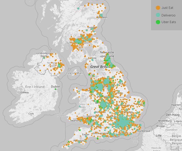
Whilst Deliveroo has the most choice (in terms of sheer volume of takeaways), Just Eat has by far the highest level of coverage, with ~90 % of the UK’s population covered by a Just Eat delivery option (vs. ~65% for both Uber Eats and Deliveroo). This higher coverage rate is largely driven be greater coverage in more rural areas, where Uber Eats and Deliveroo tend to focus on more urban/higher population areas.
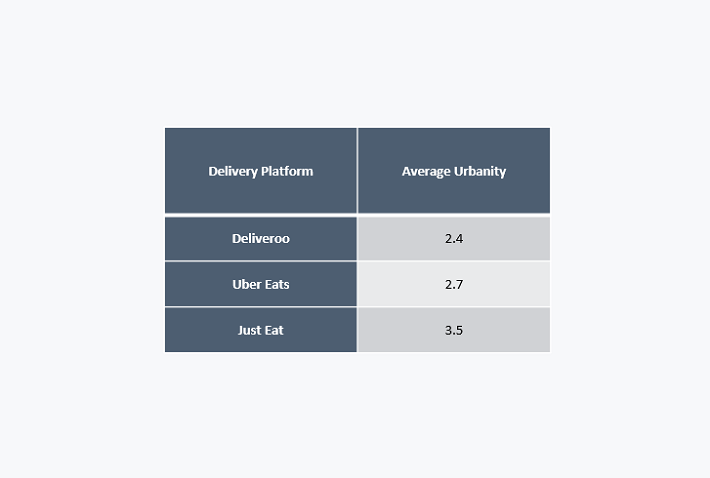
We can prove this using Geolytix’s urbanity scale. The average urbanity for a takeaway on Just Eat is indeed less urban than for Uber Eats or Deliveroo. Note an urbanity of 1 represents a very urban location, and 9 a very rural location:
Back to choice. By extracting takeaway counts by Shopper Town, we can identify which areas have the highest number of takeaway outlets with online delivery options. Unsurprisingly, Central London, Birmingham, and Manchester rank in the top 3 by number of takeaway outlets. Where there are people, there are takeaways. If we look at Population per Takeaway Outlet, the results would be as seen below...
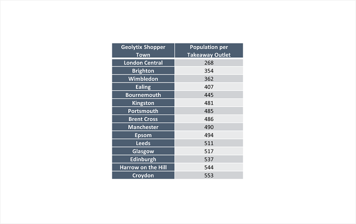
The Shopper Towns above have the most takeaway choice per capita for people using the three main online delivery platforms. Looking further down the list, my own Shopper Town does indeed have less choice, both in terms of sheer choice, and per head. So mystery solved. Note: these counts exclude takeaways not on the platforms, coverage for these platforms is typically best in more urban areas.
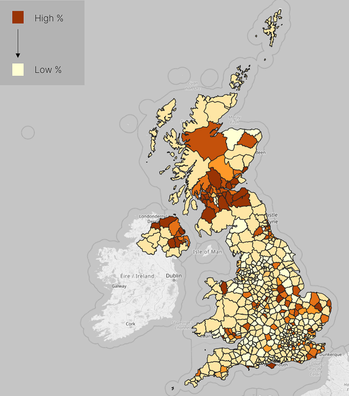
One last thing. Since I’m sure lots of us are headed to the seaside before summer is over, how about a Fish and Chips map (or rather, % of online takeaways which serve fish and chips):
The analysis above is using our data from 2020. As these platforms have continued to grow over the past year, it is likely that the number of takeaway options on each has also grown.
Danny Hart, Data Scientist at Geolytix